Lively Bunch
Finally, I am excited to be able to share with you a little project I had a hand in working on last year. I always say the hardest thing about working on client projects, is not being able to share them as they progress as I usually do with my personal projects but it is always great when I get to see the final product and can then show you where it began.

Now, when I say little project, it was really only little in artwork size but big on the amount of hours and care that went into it. I was approached by Emma (a Senior Account Manager) at Co-Partnership to make an illustration for a young, chilled red wine they were engaged to create the branding for under the Jacob’s Creek label. Of course the first thing I did was look at the impressive portfolio of work that Co-Partnership has on their website and was suitably nervous to think how I could contribute to this project. But then it was time to just put my head down and do the work. And these creative wonders at Co-Partnership are true professionals with most excellent art direction so I had no need to worry as they provided lots of guidance and feedback along the way.
When I choose a bottle of wine in a wine store, I have to say I really do just pick the label I like the most within the price range I am looking for but before stumbling into the area of illustration for labels , I had never really stopped to think just how much time and thought goes into creating one single design. And when I came into this project, so much had already been done in terms of creating the brand name and the font and placement of the ‘Lively Bunch’ logo. This left a carefully defined space within which I could work which can feel quite restrictive and yet the constraints help to narrow down the endless options.

I began working on sketch outlines with the text layered beneath to see how to make the shapes work in with the lettering and where the leaf branches and grapes would go. The client had seen another leafy artwork of mine that became a guideline and starting point for this illustration but I had never actually drawn grapevine leaves before and well, that opened up a whole myriad of interpretations and possibilities. From the initial sketches, I then worked on refining the linework to a more precise version. It was very helpful to have the team at Co-Partnership layout the illustration and text framework so I could work around that rather than coming up with some drawing that they then had to try and fit in that space.
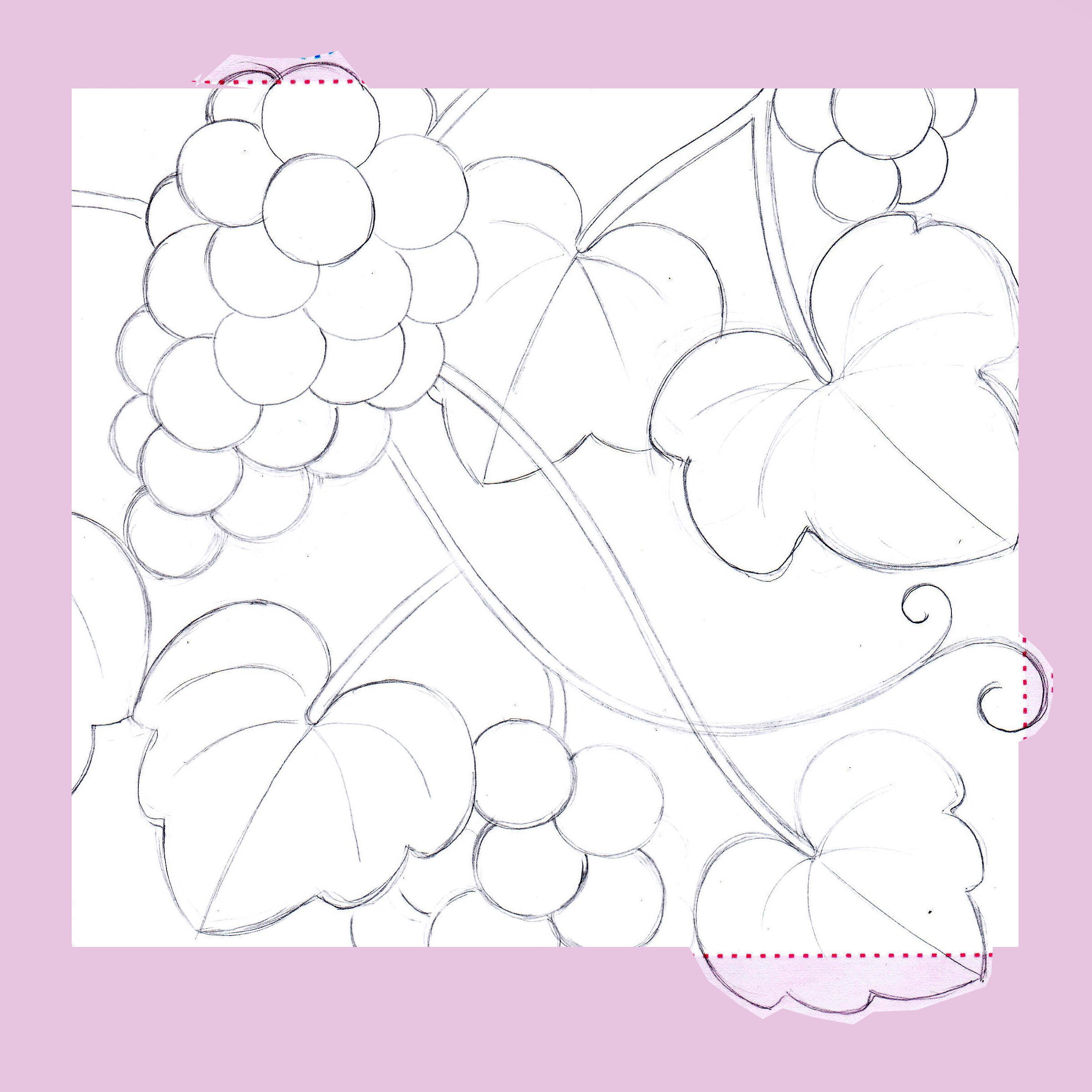
I’m just including a small snippet here of some of the sketches and colour roughs that I completed during this process. Co-Partnership and the client also had a fairly strong sense of the colour palette they wanted to use - also inspired in part from another painting of mine, but I still had fun looking at different colour combinations and options which is always my favourite part.

The final painting was completed in gouache and then photographed (with much gratitude to my hubby, Hiro) to deliver the digital data. I think it’s interesting to note that this design could have very much been produced digitally, so I am really happy to know that Co-Partnership and the client valued the time that it took to create the artwork in this way. And I like to think there is some kind of warmth and depth included from the touch of a human hand that comes across in the end product.

And it is wonderful to see the final result and how it all came together. I was a little disappointed my little curly flourish of gold vine didn’t make it into the final version but looking now at the finish of the label and the gold elements, I’m quite sure it didn’t need it! Many thanks to Co-Partnership for asking me to work on this with them and also a huge thanks to Guy Davies ( @guydaviesphotographer ) for his beautiful photography of the final product and allowing me to share it with you here.

