23rd Street Distillery - Violet Gin

Back in February this year, I began work on a new project for 23rd Street Distillery. The brief was an illustration for a new colour-change gin taking inspiration from the Butterfly Pea Flower, Finger Limes, Wattle Seed, Juniper berries, Blood Limes, Pepper Berries and Lemon Myrtle. I don’t take on many commissions in a year and it is always hard working on projects that I can’t share straight away. A lot of my Instagram feed is filled with pics of daily progress photos as I work and if I can’t share any of these for over a month, it leaves a huge gap in images to share.
The Violet Gin officially launched yesterday so now I can happily share with you all the work in progress snaps from concept sketches through to the finished painting. It is always exciting to see the finished product and have my art used in this way.

It can be daunting to know where to start on a project like this but the Butterfly Pea Flower gave me a strong graphic element to begin with.
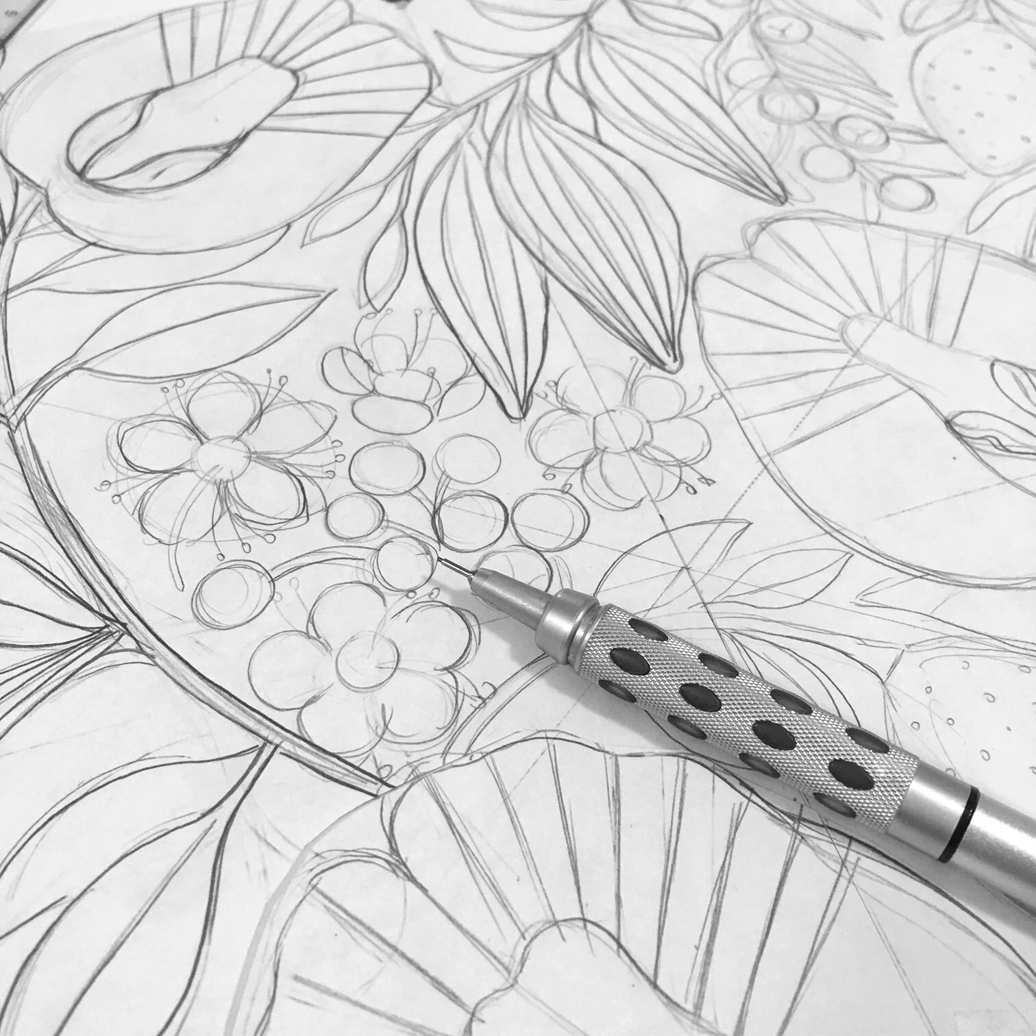
I always begin with the linework first before I think about colour.

Colour roughs are always the fun part!


So many possibilities for colour. I knew the colour of the gin would be a violet/blue colour so we needed something that would either harmonize or contrast with that. I was also thinking about the colour change properties of the gin - how the violet would change to pink with the addition of tonic or acidic mixers. I also thought about the appearance of a cocktail with ice at the top making the colour lighter and deeper tones at the bottom of a drink. The choice came down to the pink or yellow. I really liked the idea of the yellow and how brightly that would appear on the label but in the end, I think we knew the pink was the right choice given the nature of the drink.

And then the painting began…

A lot of time was spent mixing and planning those pinks to make a gradual blend from pale to dark.

Adding some yellow…

And some blues for the juniper berries

Some subtle wattleseed to contrast with the bright colours

Close up on the berries
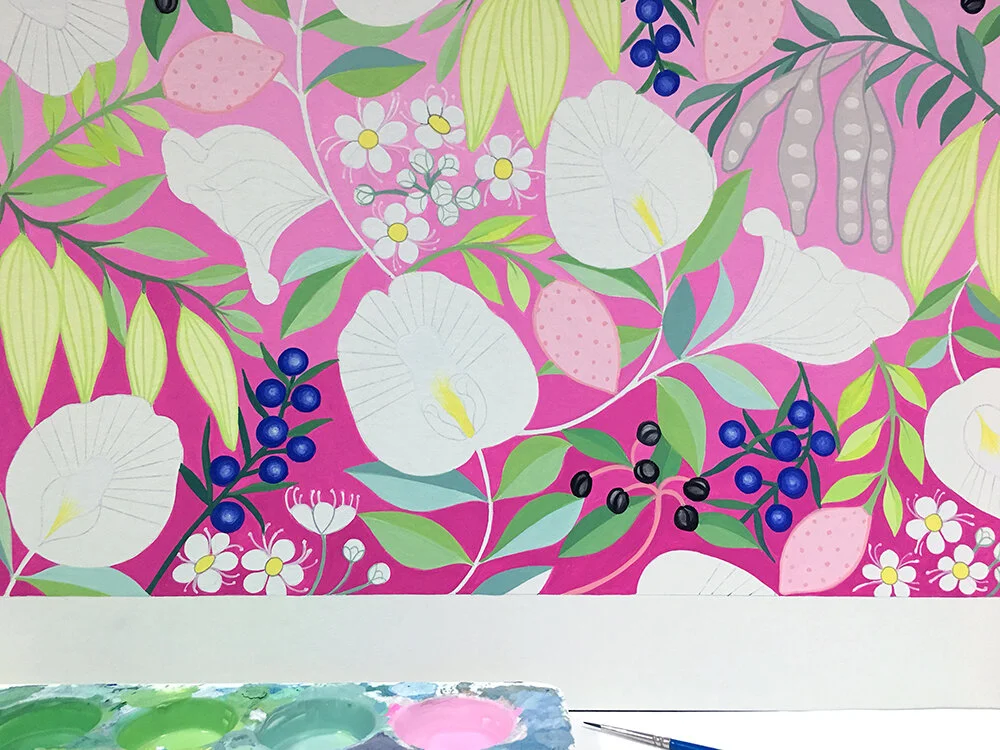
Green leaves

Starting on the Butterfly Pea Flowers.

Almost there… just need to outline the flowers.

The finished painting. Sometimes I paint the flowers first and the background last but in this case I needed to make sure the background was right before proceeding. Painting in gouache, you don’t really get a second chance as it’s difficult to paint over so there is a lot of holding my breath doing the fine lines but always good to get to the completion stage.